


Canada in focus.
Ideas without borders.

EBJ / Work & studio

Ideas, made
visible.

A closer look at creative direction, visual expression and digital experiences.

EBJ campaign creative

Campaigns in focus.

A closer look at the ideas, compositions and craft behind three pieces from our own brand campaigns.

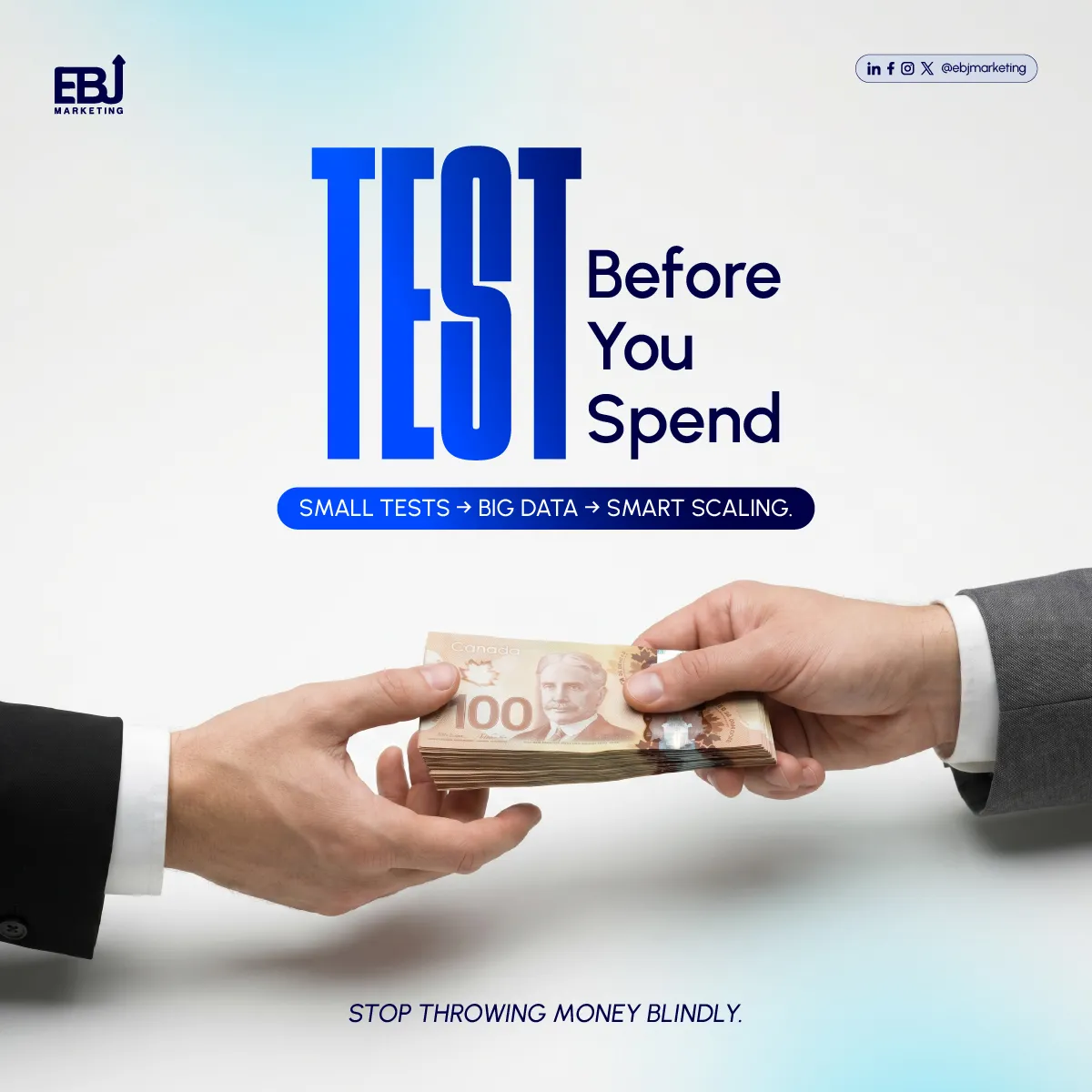
EBJ checkout campaign featuring a shopper, oversized mobile checkout screens and The Sale headline.

E-commerce campaign creative

E-commerce checkout, made visual.

Put the buying journey in the picture.

This EBJ campaign uses a shopper, oversized mobile checkout screens and a direct headline to make an often invisible part of e-commerce tangible. The composition connects the person, the interface and the buying decision in one frame.

A pale blue background gives the devices and cobalt typography room to stand out. The angled screens create movement while keeping the central message readable at social-feed size.

A clear role for the creative.

The artwork introduces a conversation about what happens after a customer reaches checkout. It can support a website or conversion campaign where the landing page explains the specific friction being addressed, the evidence behind the recommendation and the next step.

From campaign to customer experience.

A strong visual earns attention; the destination must then answer the visitor's questions. Our website and funnel work considers the message, form or checkout, and follow-up as connected parts of that journey.

Project scope.

Visual composition, social advertising design and typographic direction for EBJ MARKETING's own campaign communications.

Explore our website and landing-page services, review our conversion approach or read our mobile landing-page audit checklist.
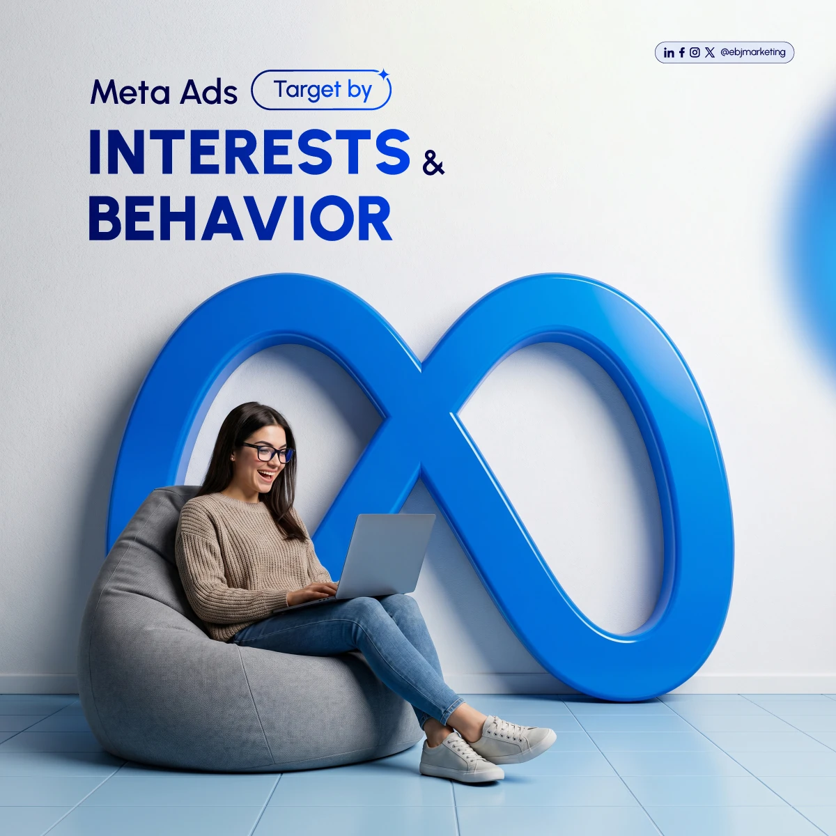
EBJ Meta Ads creative featuring a woman using a laptop beside a large blue loop and an Interests and Behavior headline.

Paid social campaign creative

Meta Ads, built around the audience.

Make audience relevance the central idea.

This EBJ paid-social artwork brings a person into the centre of a dimensional blue composition. The oversized loop, laptop and concise headline create a recognisable setting for a campaign about reaching a relevant audience.

The light background and strong blue forms give the piece a different rhythm from our darker campaign work. The person remains the focal point, connecting a platform theme with the people a campaign is intended to serve.

Connect the audience, message and offer.

The creative introduces the subject; campaign planning determines how it is applied. Audience options, availability and delivery depend on the platform and campaign setup. We approach audience planning alongside the offer, the creative angle and the destination page.

Design a useful test.

Variations should answer a defined question about the message or audience response. We use a shared visual identity across alternatives while keeping the change meaningful enough to evaluate.

Project scope.

Social advertising design and visual composition for EBJ MARKETING's own communications.

Explore our paid-media services, see our creative approach or read how to investigate low-quality paid-social leads.

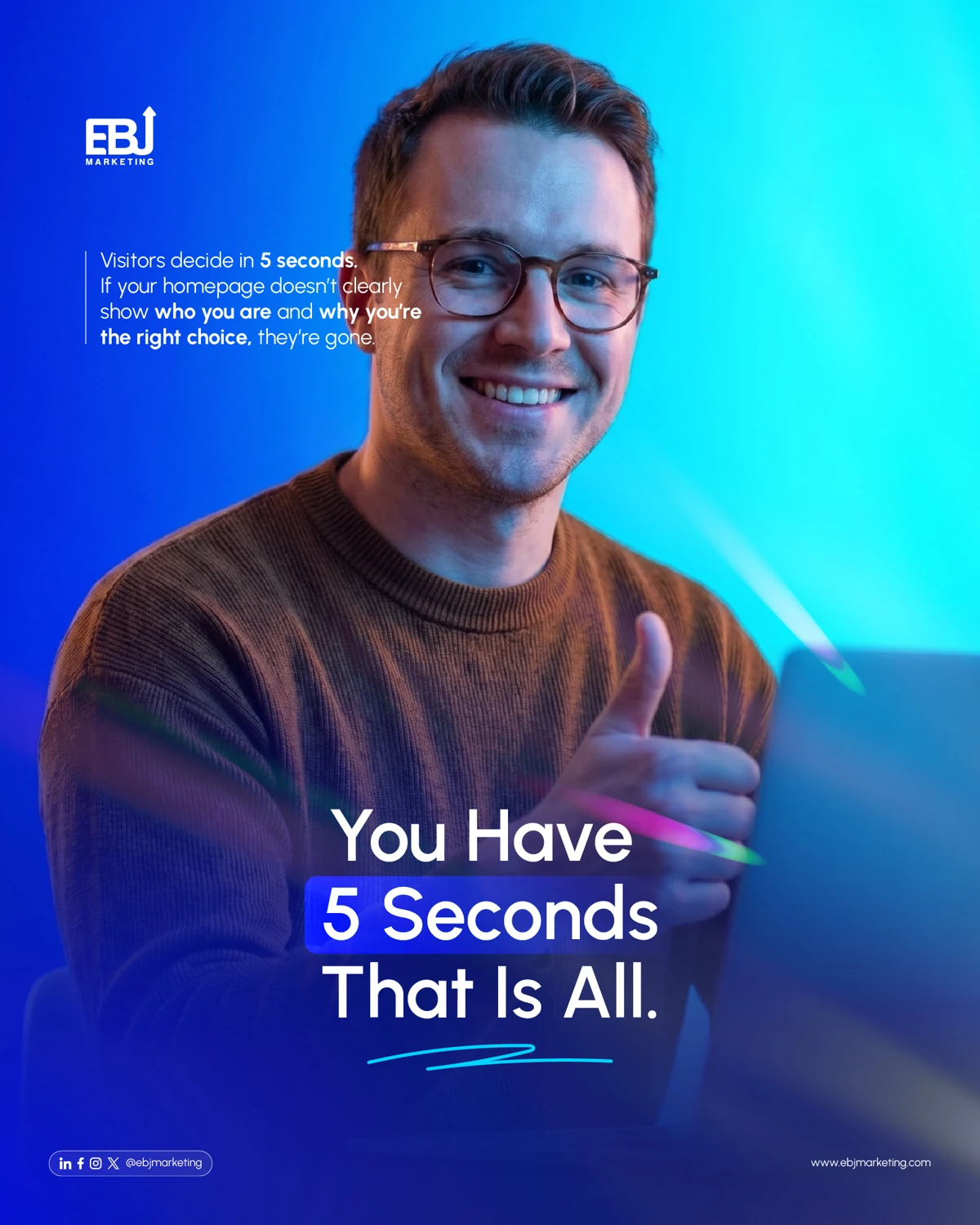
EBJ website campaign featuring a smiling man in blue and cyan lighting with a five-second first-impression headline.

Website campaign creative

A first impression that earns attention.

Start with a person, then make the message clear.

This EBJ website campaign uses a warmly lit portrait against a vivid blue and cyan setting. The human focal point provides an approachable entry into a practical subject: whether a visitor can quickly understand the business and the next step.

The short headline, controlled palette and open composition give the message a clear hierarchy. The artwork's five-second line is a creative framing device, not a measured result from a client test.

Carry the promise onto the page.

The website opening should explain who the offer is for, why it matters and where the visitor can go next. Visual energy supports that job when the heading, supporting copy and call to action remain readable across screen sizes.

Consider the full experience.

We connect the campaign message with page structure, mobile usability and the enquiry journey. Motion, imagery and typography have a role, alongside loading performance and the practical information a visitor needs.

Project scope.

Portrait-led image composition, typography and social campaign design for EBJ MARKETING's own communications.

Explore our website services, read what belongs in a website redesign brief or compare hero video and imagery trade-offs.

The EBJ studio

Ideas, made tangible.

Original studio concepts and applications: a closer look at how we connect visual identity, digital experiences and campaign thinking.

EBJ studio concept / Websites

Space to make a better impression.

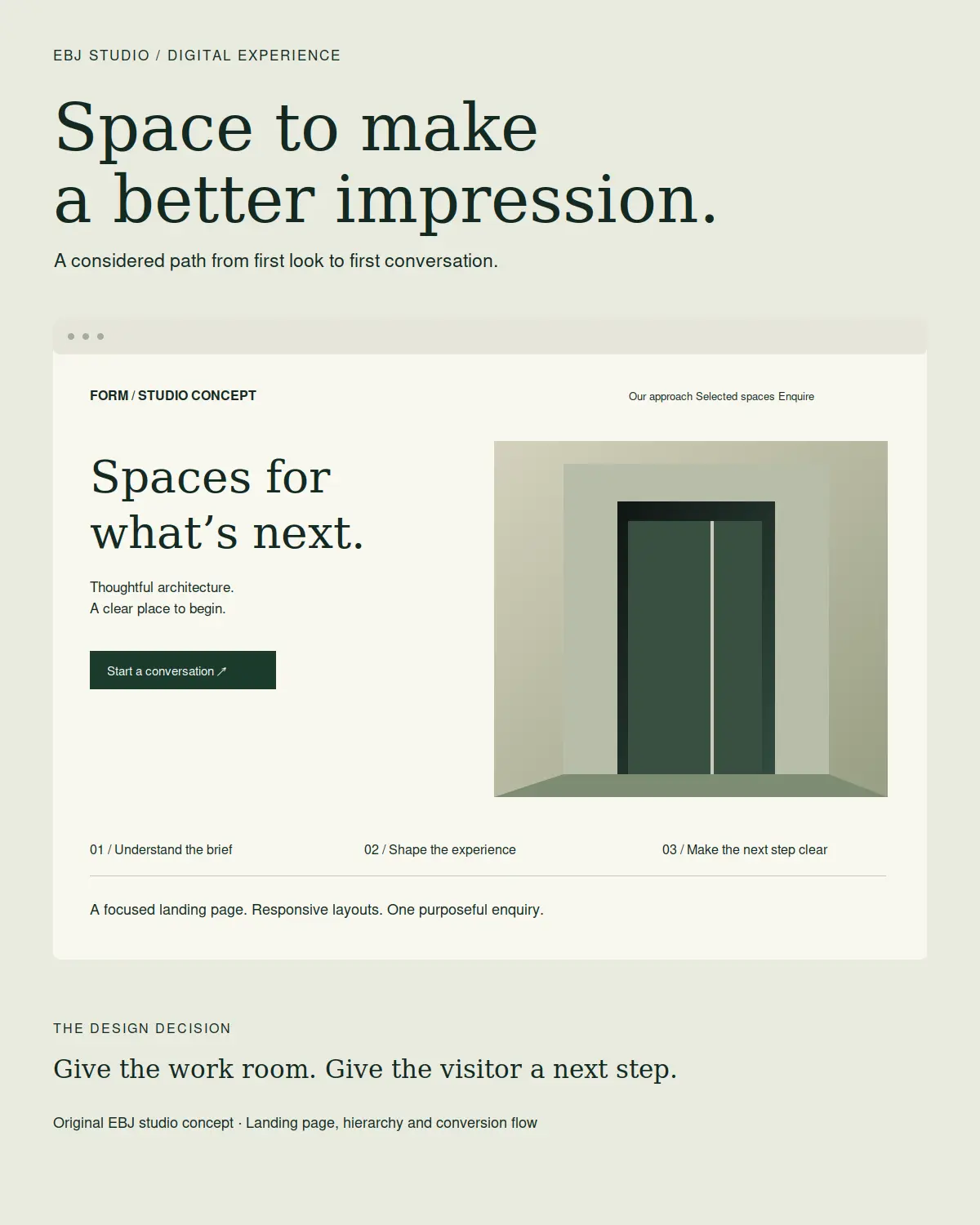
EBJ studio architecture landing page concept with stone-green spatial illustration, editorial typography and a clear enquiry call to action.

A service website with a clear first impression.

This original EBJ studio concept explores how an architecture or design practice could introduce its work without overwhelming a new visitor. FORM is the working name inside the concept. The composition and interface were created for this study; this is not a commissioned client website.

The brief.

Create a calm, distinctive landing page that explains the service, establishes a visual point of view and makes an initial enquiry easy to find. The spatial illustration, restrained palette and editorial typography share the same purpose: give the work room while keeping the next step visible.

From desktop hierarchy to mobile decisions.

The desktop composition places the message beside the architectural study. On a narrow screen, that order becomes one reading path: a specific headline, a short explanation, the enquiry action, then the supporting visual. Navigation and secondary links support the enquiry instead of competing with it.

What EBJ designed.

Art direction, original vector illustration, page composition, interface copy and an enquiry flow. The study also defines a practical page sequence: introduction, selected work, process and contact. The illustrated screen is a design prototype rather than a live client service.

What a real launch would measure.

We would validate keyboard and mobile navigation, confirm successful enquiry delivery and compare qualified enquiries with relevant landing-page visits. Those are proposed validation steps; this concept has no live campaign or conversion results.

Explore websites and landing pages or discuss a focused website experience.

EBJ studio concept / Paid media

A strong idea. More than one angle.

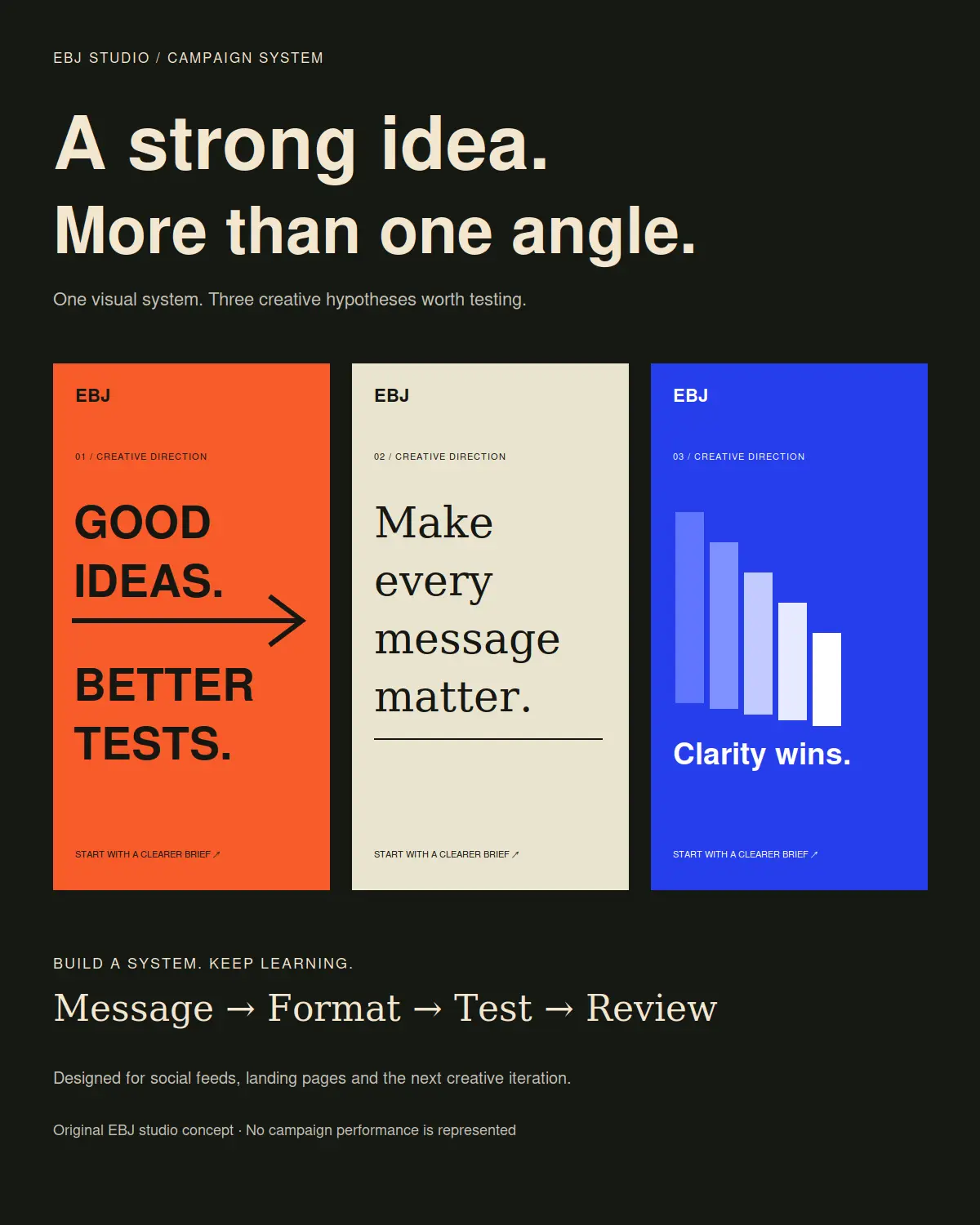
Three EBJ campaign concept posters in orange, ivory and cobalt, exploring typography, message hierarchy and visual consistency.

Build a campaign language, not just one post.

This original EBJ studio concept demonstrates how a central idea can produce several distinct creative directions. It uses EBJ’s own marketing message and contains no client endorsement, media spend or campaign results.

Three directions with different jobs.

The first treatment uses compact, forceful typography to make the testing message immediate. The second uses editorial type and more space to make the message feel considered. The third gives clarity a visual rhythm through a stepped graphic. Each treatment retains a recognisable structure and a purposeful next step.

A useful testing question.

A real campaign would begin with an audience and an offer. The initial question could then be whether a direct testing message or a more considered value message attracts more relevant enquiries. The offer, landing page and measurement definition would remain consistent for a fair comparison.

What EBJ designed.

Three original vector-led campaign compositions, headline hierarchy, a shared call-to-action approach and the foundation for feed, story and landing-page variants. Each format would be re-composed for its available space and interface overlays before launch.

From creative to a complete journey.

The click should lead to a page that continues the same promise. A successful submission, confirmed by the website, should be distinguished from a click on the submit button. Lead quality and sales feedback would inform the next iteration alongside platform reporting.

Explore paid media, see our creative approach or discuss a campaign system.

EBJ studio application study / Brand design

One clear signal. Every touchpoint.

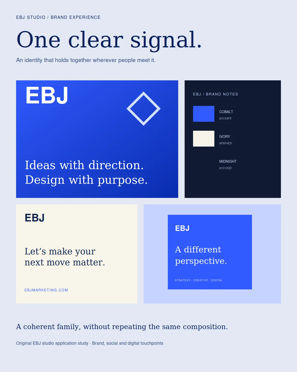
EBJ brand application board with cobalt and ivory identity compositions, colour swatches, social artwork and digital communication examples.

An identity should work as a family.

This studio application study expands EBJ’s own blue-and-diamond identity across several communication formats. It is work for the EBJ brand, with original vector compositions created for this presentation.

Consistency without repetition.

Cobalt provides a recognisable anchor. Ivory creates space for longer messages, while midnight gives high-contrast applications a quieter setting. The diamond cue and EBJ wordmark remain identifiable as typography, scale and composition change.

Different formats, one point of view.

The presentation includes a primary brand panel, a colour reference, a compact communication layout and a social composition. Rather than shrinking one artwork into every format, each application gives its message an appropriate amount of space.

What EBJ designed.

Original application layouts, a coordinated colour system, typographic hierarchy and brand-led communication examples. These are visual applications of EBJ’s identity, not a claim of third-party client work or a replacement for final production specifications.

Ready for a practical handoff.

Source artwork uses editable vectors. A production handoff would include export sizes, safe areas, contrast checks and clear rules for using the mark on light and dark backgrounds. A consistent system makes later design decisions easier to explain and maintain.

Explore creative and design or talk about a more coherent brand experience.